Personal Background
Jenny Van Sommers was born and raised in Australia, she went to school in Sydney where she failed art school, but she didn’t let that define nor stop her. She went on to establish herself as one of the top still life photographers winning multiple awards for her work. She currently lives in Sei, London where she does lot’s of her work but she also travels around the world usually going to the US and France. Sommers has done work for editorials and advertising projects for top fashion magazines including Vogue, Calvin Klein, Tiffany & Co, Sonos, Bandit, etc. She continues to brand herself as a skillful and successful artist, and take on more jobs with high-profile clients.
Style
Jenny Van Sommers has a very unique style when it comes to still life photography. Almost every one of her photos has a blank or simple background, nothing distracting or abstract. Sometimes the background will cast a shadow and other times it will just be a light box. She uses many geometric shapes to enhance her photograph and showcase her very distinctive style. Her photos often have a modern feel to them because of how few and simple objects are in each photograph. In my opinion her photos always leave room for interpretation, the viewers can decide what Sommers is trying to say and there isn’t one right answer.
Philosophy
In my opinion one of the driving philosophies of Sommers is to not strive for perfection, because you will never achieve it. Sommers work is incredibly different from most still life photographers today but it works. When you look at her photographs you may not think they are the most impressive but they are authentic and every photograph has a deeper meaning left to the audience to interpret. She once said in an interview that she gets “inspiration from all over” and I think that is another one of her philosophies, to photograph what inspires her and to not search for the perfect photograph, which comes back to her philosophy about not striving for perfection. Sommers photographs lots of objects that may seem meaningless but when you study them long enough you can see a deeper meaning.
Influences
Sommers admitted in an interview that her work is very much influenced by other professional artists. She stated that her “work is a combination of [her] admiration for Irving Penn, Elsworth Kelly and Sarah Lucas.” Later in the interview she explained how she has “always liked geometry and three-dimensional shapes.” And how “[She’s] very attracted to those very simple, modern things.” Sommers revealed how light is what first drew her to photography and wanting to “document it’s immediacy” is a goal of hers. In conclusion, several successful artists and photographers, and her fascination with light has heavily influenced her and her work.
Compare and Contrast
|
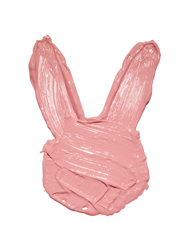
Jenny Van Sommers (pink bunny painting)
|
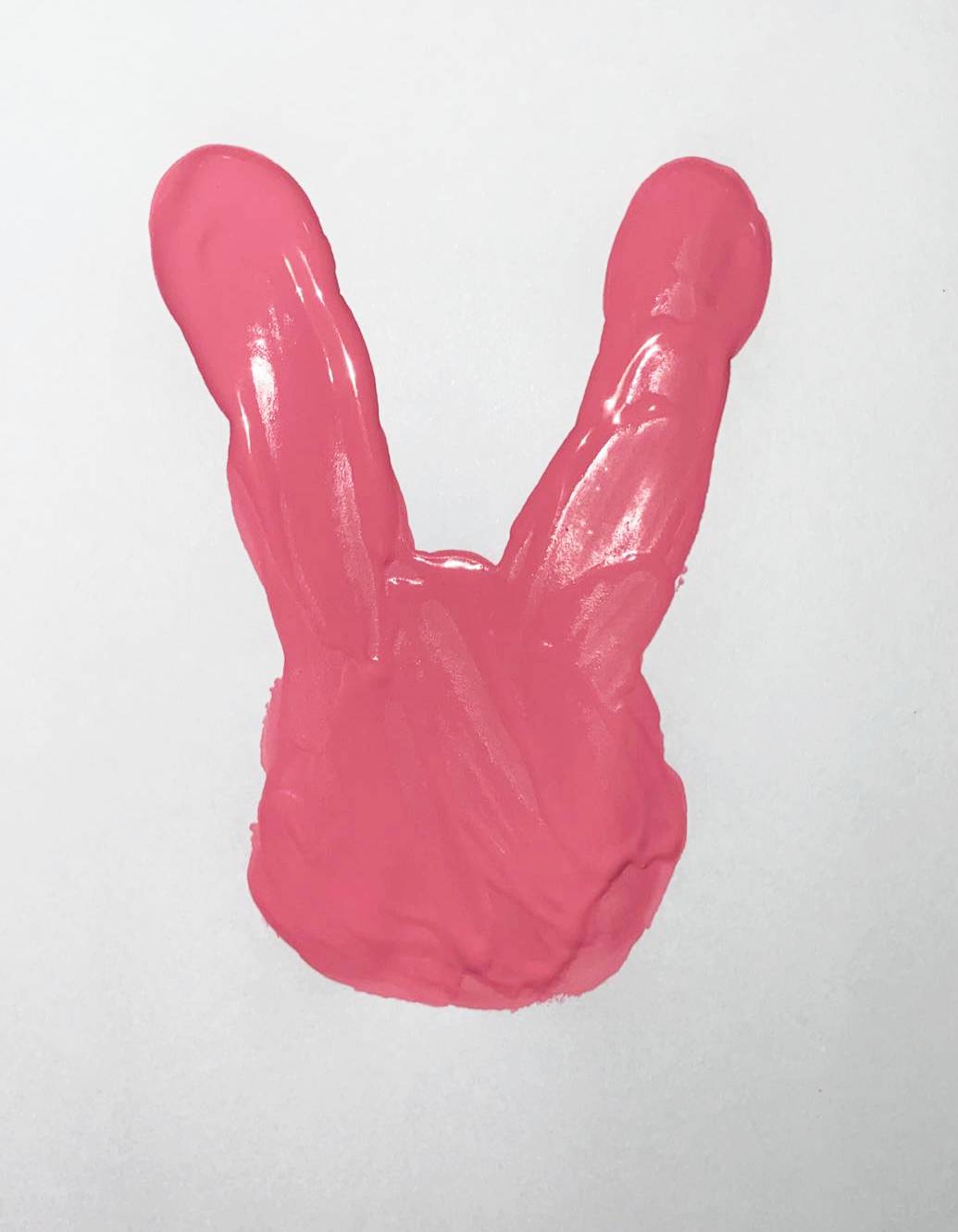
Casey Vigo (Finger Paint)
|
This picture proved harder to take than I had first expected because trying to find the same pink color that Sommers had used on her finger painting was pretty difficult. I had to play around with a couple different shades of pink before I finger-painted the bunny onto the white paper. After that I had to photograph the painting on an all white background without any shadows getting in the way, that was pretty hard to do. I had to keep rearranging where my painting was positioned so that there was no shadow casted from my camera. I brightened the photo in photoshop and erased any paint splotches that had splattered away from the main image, I also adjusted the vibrance to make the pink stand out more. The lightning definitely was difficult to work with, but I figured it out in the end and was able to capture a good photo.
|
Jenny Van Sommers (VOGUE)

|
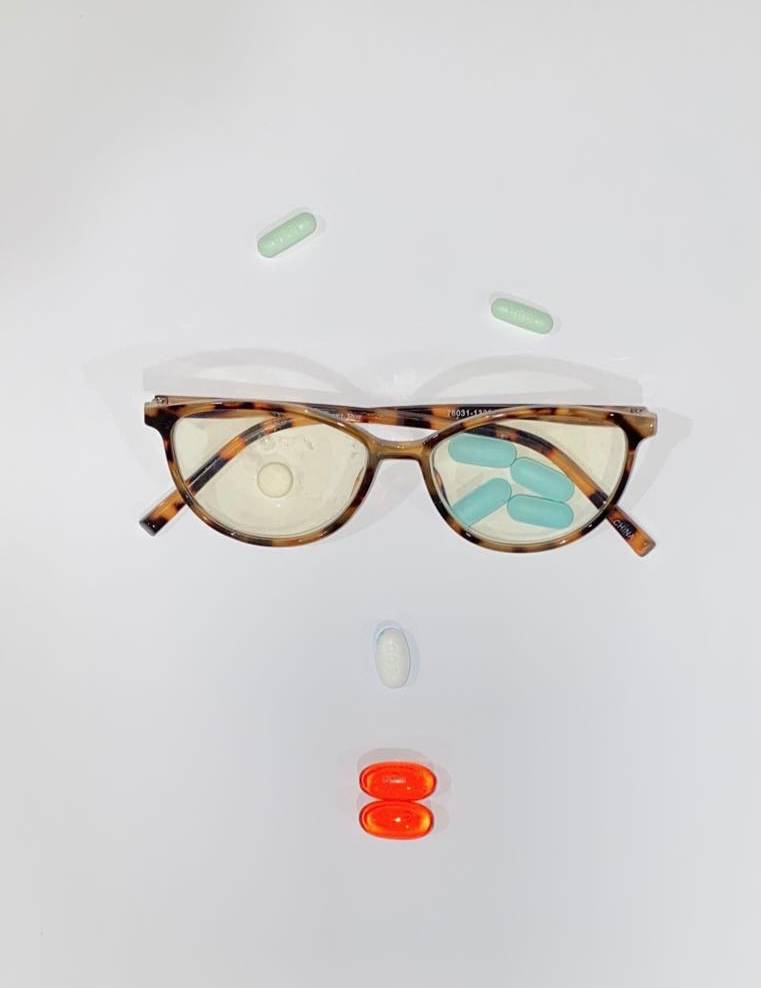
Casey Vigo (Face of Pills)
|
For this picture, I had to find a bunch of different pills that were different colors and place them in certain positions, in an effort to replicate the photo Sommers took for VOGUE. After I gathered all the pills I found a pair of my mom’s reading glasses that were that same tortoise shell color Sommers used. I placed everything on large sheets of white paper and arranged it to look as similar to Sommers as I could get it. I again struggled with not having any shadows in the picture, and as you can see the glasses cast a little bit of a shadow in my picture. She uses these bright white backgrounds for lots of her photos which makes it hard to take a picture without any shadows, but I did my best.
|
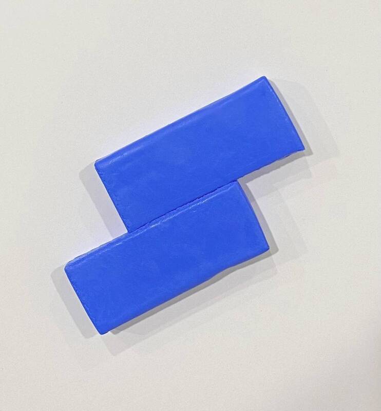
Jenny Van Sommers (blocks)
|
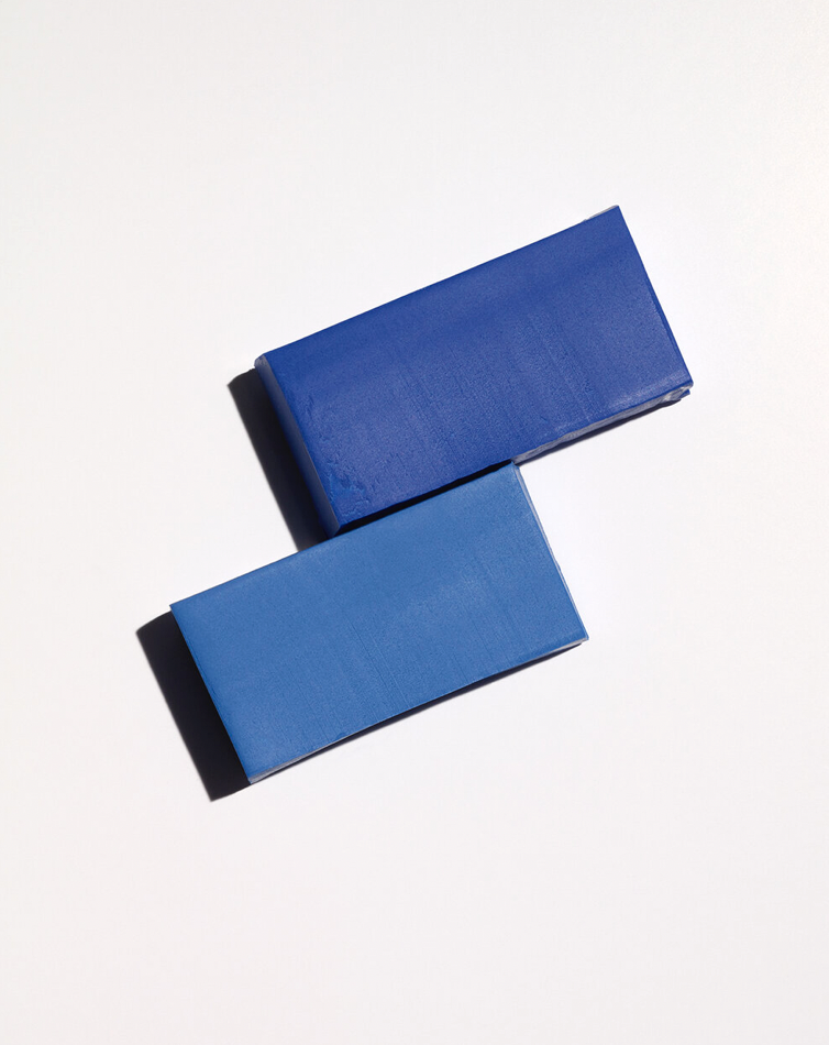
Casey Vigo (Blue Clay Blocks)
|
This image was the easiest to photograph after I positioned the blue blocks together. I went to Micheals and bought clay blocks to replicate the photo Sommers took. I then arranged them side by side, but at an angle upwards and took the photo on a white background. I had to again try my best to avoid the shadows and capture a good picture. I had to take multiple photos and test out different angles before I found the best one. I brightened it in photoshop and made the clay blocks as smooth as possible before adding it to my report.
Artist Statement
I really enjoyed this assignment. I especially liked how when replicating Sommers work I have to actually build my photo rather than just taking a photo of a sunset for example. I had to get creative and gather materials around my house as well as buy a few things. For each photo I had to use a white backdrop and adjust the brightness/contrast, vibrance, and exposure in Photoshop. I also deleted any flaws I saw in the photos, to make them seem as professional as possible. I struggled with avoiding shadows but I did my best to limit their appearance in my photos. Sommers has a very unique style and I enjoyed learning more about her and the type of photos she takes. I had a lot of fun with this project!
Sources
https://www.jennyvansommers.com/new-page
https://www.connectionsbylebook.com/geneva2018/nominee/jenny-van-sommers
https://lukegreenphotography.weebly.com/jenny-van-sommers.html
https://www.itsnicethat.com/articles/jenny-van-somers-1
https://www.nowness.com/story/photographer-jenny-van-sommers-still-lives
Images
Pink Bunny
https://www.jennyvansommers.com/new-page
Blue Blocks
https://www.jennyvansommers.com/new-page
Glasses and Pills
https://www.vogue.co.uk/article/do-nootropics-work
